Packaging & print
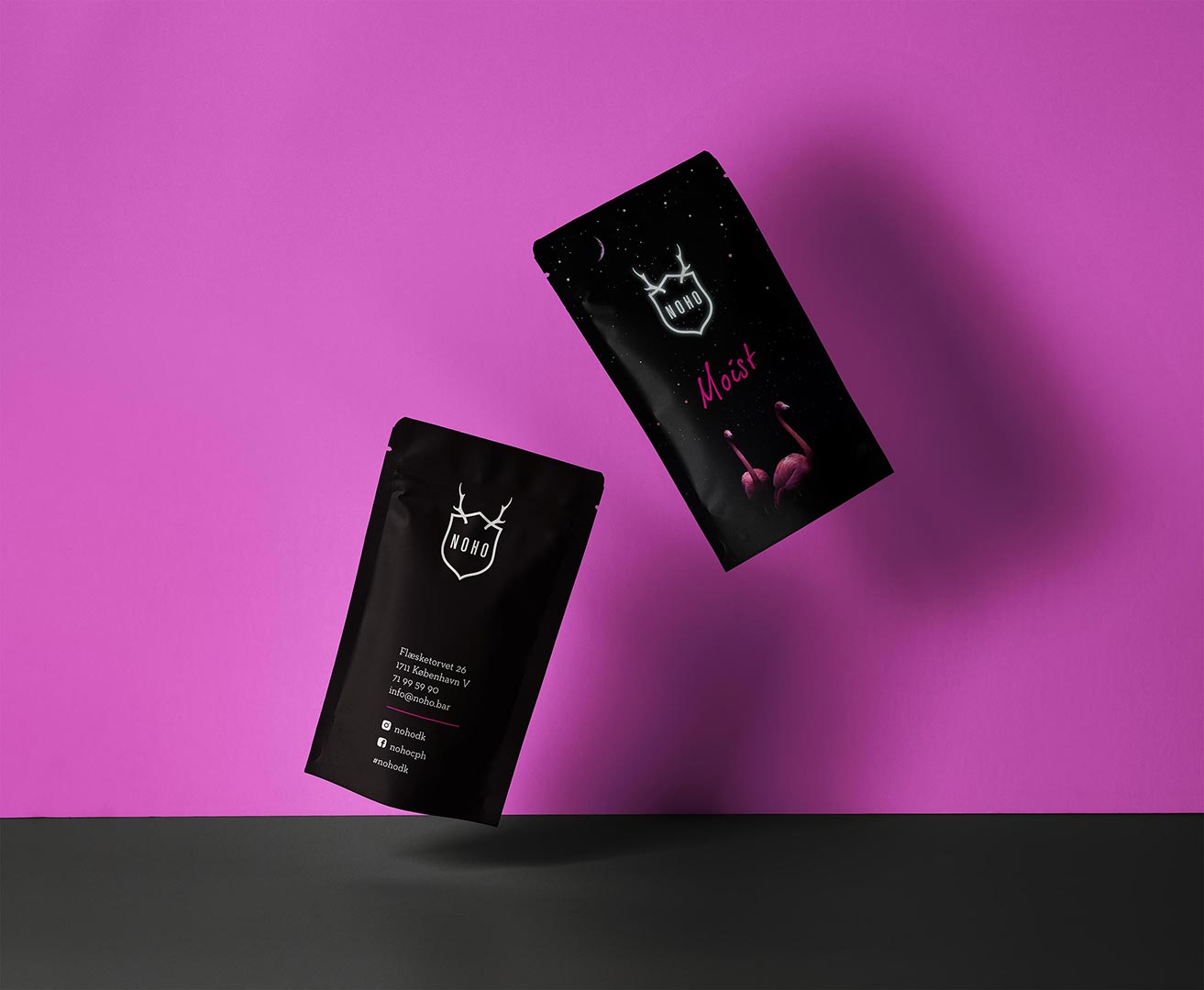
NOHO – “Moist Inside” wet-wipe packaging in the brand style
NOHO in Copenhagen wanted a small wet-wipe package that feels like a natural extension of the venue’s visual universe: raw materials, strong contrasts, neon/deep colours and a playful twist. Our task was to extend their style guide and translate the vibe into a physical pack that’s practical in service and unmistakably NOHO.
- Branded look: dark base, high-contrast type and graphic accents in NOHO’s colours.
- Format & use: compact pack built for bar service; easy to hand out with orders.
- Materials & finish: stock choice, coating/lamination and durable colour reproduction.
- Production: press-ready files, colour management and vendor coordination.
- Consistency: aligned with existing merch and interior without copying them 1:1.
Deliverables
- Art direction and visualisation extending NOHO’s style guide
- Dielines, layout and typographic system for small format
- Colour management, print proofs and QA
- Press-ready PDFs and production coordination
Outcome
A small detail with big brand impact: the packaging feels unmistakably NOHO—bold, playful and cohesive. Robust production stands up to busy service, and the clear design is instantly recognisable at the table. The solution is easy to reprint and adapt for events and seasons.
Need packaging or printed materials that truly match your brand?
Let’s talkProject date
12. September, 2019
Client
Noho
- App Design
- Art Direction
- CSS
- Design
- Development
- Digital
- E-Commerce
- Frontend Development
- HTML
- JavaScript
- Layout
- UI
- User Experience
- UX
- Web
- Webshop