Logo & visual identity
Novohair – clean wordmark with a subtle hair reference
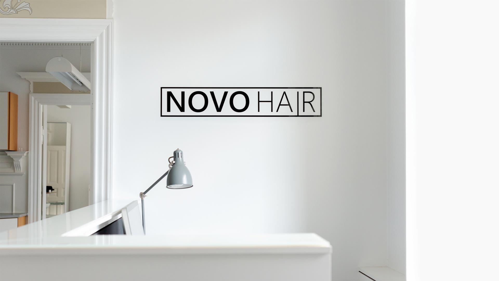
Novohair is a clinic specialising in hair transplantation. They needed a serious, light and minimalist logo that works across channels. We designed a wordmark where “HAIR” is anchored to a fine baseline frame – a subtle nod to the hairline. The logo was delivered in two variants for flexible use on signage, print and digital.
- Minimal wordmark: clean, modern look with strong legibility.
- Subtle symbolism: baseline frame under “HAIR” referencing the hairline.
- Flexibility: light/dark versions for different backgrounds and media.
- Clinical credibility: balanced between medical authority and approachability.
Deliverables
- Logo design in two variants (positive/negative)
- Typography and colour recommendations
- Basic usage guide for print and digital
- Production-ready files (SVG, PDF, PNG)
Outcome
Novohair now has a timeless, scalable logo that communicates professionalism and calm – with an elegant reference to their speciality. The identity works equally well on signage, website and patient materials.
Need a clean, long-lasting logo for your brand?
Let’s create it togetherProject date
6. February, 2019
Client
Novohair
- App Design
- Art Direction
- CSS
- Design
- Development
- Digital
- E-Commerce
- Frontend Development
- HTML
- JavaScript
- Layout
- UI
- User Experience
- UX
- Web
- Webshop