
Print design for restaurant & bar
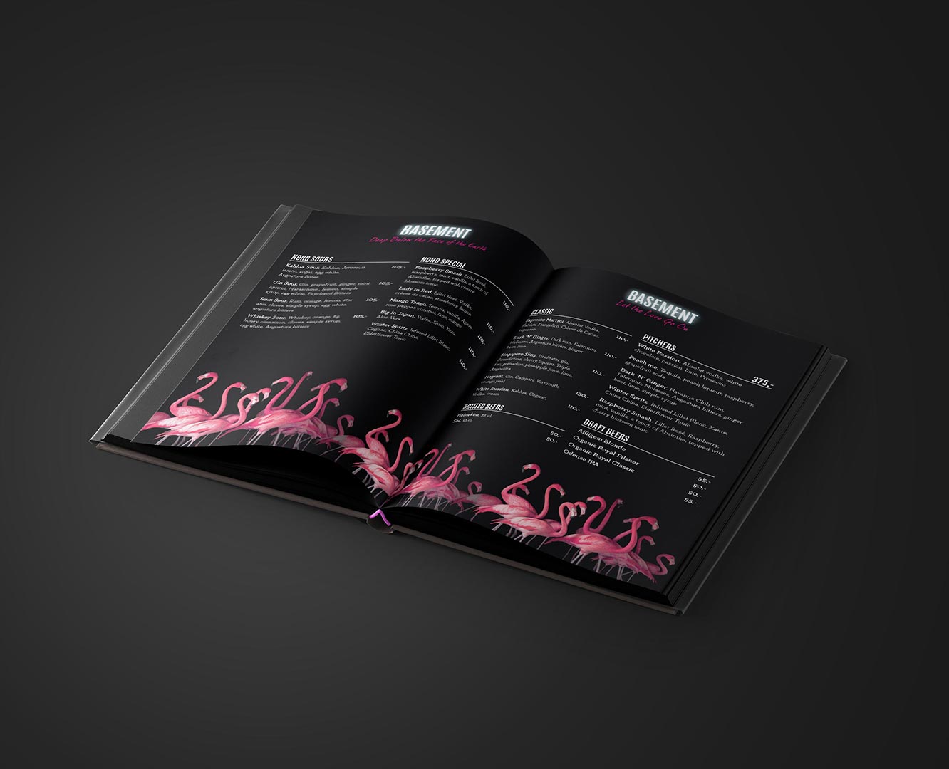
NOHO Basement – compact menu in a dark theme
NOHO in Copenhagen needed a menu that fits a lot of information on a few pages while remaining easy to read in low light. A dedicated “Basement” version was required for the nightclub area with a darker, edgier look. The challenge was balancing information density, clear typography and a visual style that matches the venue.
- Compact layout: grid and clear hierarchy to present many items without clutter.
- Legibility in low light: contrast-tested palette, type choices with good x-height and spacing.
- Dark theme: Basement variant with dark background, neon accents and graphic details.
- Category navigation: icons, subheads and price lines for quick scanning.
- Production: stock selection, print profiles and finish optimised for bar wear and tear.
Deliverables
- Art direction and visual theme for main menu and Basement version
- Typographic system, icons and price styling
- Layouts for few pages with high information density
- Press-ready PDFs, colour management and production tests
Outcome
A menu that’s easy to navigate—even in low light—while reinforcing NOHO’s brand. The dark Basement edition feels like a natural part of the venue’s atmosphere, and the compact layout makes updates and reprints straightforward. Practical to run, distinctive in expression.
Need menus or printed materials that fit your brand?
Let’s talkProject date
15. May, 2019
Client
Noho
- App Design
- Art Direction
- CSS
- Design
- Development
- Digital
- E-Commerce
- Frontend Development
- HTML
- JavaScript
- Layout
- UI
- User Experience
- UX
- Web
- Webshop
